SOLIUM INFERNUM | PC | Interface Design / Game Design (2022 - 2024)
BETTER TO RULE IN HELL THAN SERVE IN HEAVEN.
Take the Infernal Throne in this hellish turn-based grand strategy game. The Prince of Darkness has vanished, leaving Archfiends to conspire: muster your legions while intoning dark sorceries, devilish schemes, and Machiavellian plots. Who will be the new ruler of Hell and ascend the Throne?
Re-imagined from the 2009 original, as the solo UI/UX designer on the project I designed the structure, layout and function of the entire UX from the ground up, creating 100’s of designs over a 2 1/2 year period - bringing modern conventions and standards to make this obtuse and complex game much easier to understand and play. I also helped develop the branding for the game and the look and feel of the UI along with Artists Ty Carey and Dave Collinson.
Below is a sample of just some of the work I was involved in on the project.
– GENERAL UI –
THE HUD
The design of the HUD was crafted from various user stories that we formed from players feedback from playing the original. The HUD in Solium Infernum has to convey a lot of information, and the original had quite a few shortfalls. Clearly conveying things like unit details, understanding your overall strength VS others, territory and movement, showing the messages and goings on elsewhere in the deeper world and your order queue all at once were key factors I considered in the design.
– THE GAME BOARD –
UNIT CARDS
The unit cards in Solium Infernum are our players ‘window into the world’ which I designed and iterated on many times to devise conventions that allowed us to maintain a large area for the Artwork while clearly showing all the information required. This design had to work across a large number of types of units and be used in a number of ways across the UI and works in conjunction with our tool-tip system to provide as much contextual information as possible. We also developed a compact list variant as in systems like targeting and inventory to be more suitable in those kind of user interactions.
– BASE CARD UNIT FINAL DESIGNS –
– THE CONTEXT –
DIPLOMACY
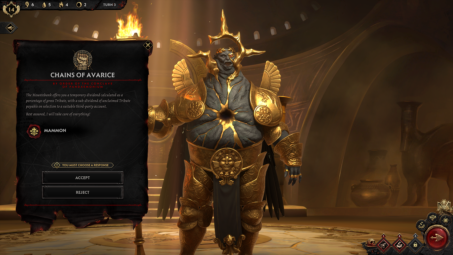
The diplomatic system in Solium Infernum is one of the largest systems in the game from a UX perspective, it required a lot of planning and thought to get right as there’s a lot of outcomes, rules to communicate and branches that can occur - below is an example of the wireframe workings of just the basic actions in the system, followed by examples of how individual screens in the flow appear in-game.
– FLOW OVERVIEW –
– GAME EXAMPLES –
RITUALS
The ritual table is where our players perform dark rituals to attack and deceive others around them. We chose to represent this in a semi-literal way, leveraging spell cards that get dragged onto a ritualistic circle to activate. The ritual system was also a deceptively complicated thing to design, Rituals in the game are very powerful, but have all sorts of restrictions, strange outcomes and possibilities that needed to be clearly communicated. Because there was too much information to fit in a card format we used tool-tips to communicate the requirements when a player hovered over a Ritual.
CONCLUSION
Solium Infernum won multiple awards and launched to critical acclaim - obtaining an average score of 85/100 on Metacritic and gaining 11 review scores of 90 or higher.
PCGamesN called it “The best strategy game in many years.”
We had frequent player feedback that we’d made the game a lot simpler to learn and understand and it found a broader audience than the original as a result.
If you’d like to see more, check the game out on Steam!


