NEED FOR SPEED: NO LIMITS | iOS / Android | Interface Art and Design (2015 - 2019)
BE WRECKLESS, BE RESPECTED.
Need for Speed: No Limits is the first free to play Need for Speed game made exclusively for mobile. The title achieved critical and financial success, with millions of players worldwide. It received an editor’s choice award on both the AppStore and Google play store, and has been featured in marketing for Apple and Samsung products.
The scope of the project changed considerably over the development period and the UI’s function and form underwent many changes as a result. I worked on most aspects of the UI in some form, from wireframe flows, prototypes on features, UI layout, branding and iconography and animation. After release I continued working on the title in live service which demanded a quicker turnaround with a smaller team.
– GENERAL UI –
THE RACE EXPERIENCE
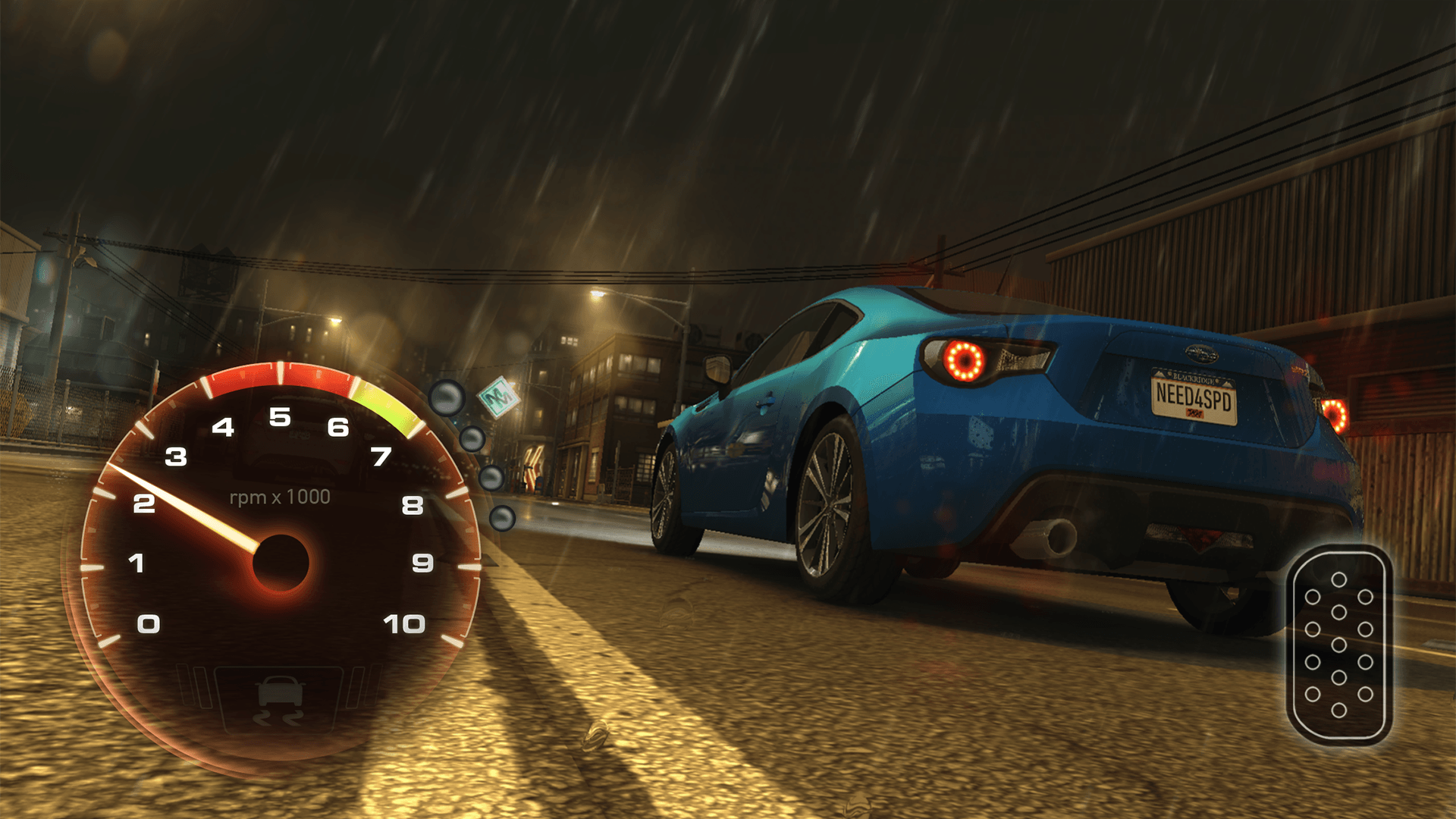
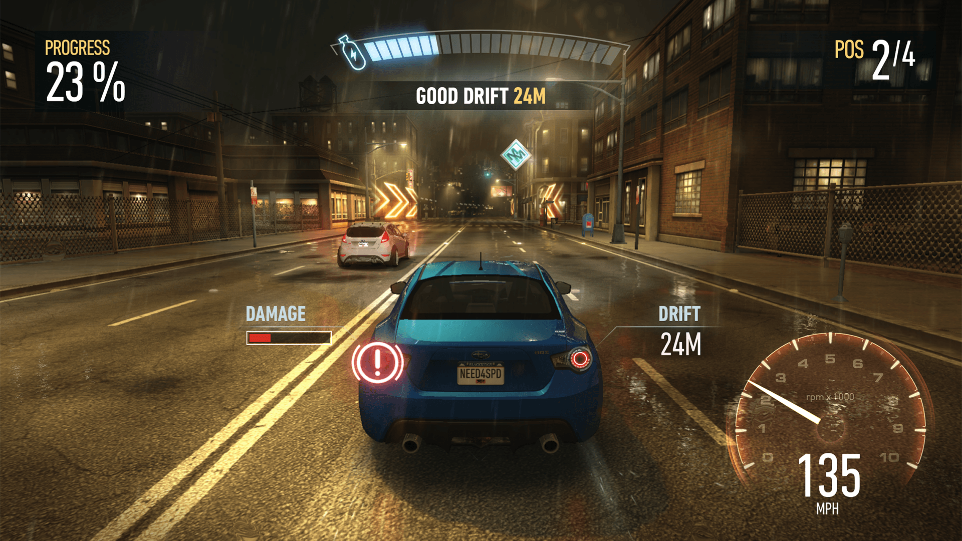
I storyboarded, concepted and designed the HUD and Pre-Race moments for the game, bringing the camera down to a more dramatic angle for the launch mini-game, which seamlessly transitions into gameplay and the in-race interface, displaying the most relevant information above and around the car.
– LAUNCH UI AND HEADS UP DISPLAY –
– LEVELING AND GENERAL TITLE TREATMENT –
PLAYER VS PLAYER MODE REDESIGN
Concept and Approach
Replace our Multiplayer game mode (Blackridge Rivals) with a revamped iteration, that gives players more to do and is more rewarding and competitive for more types of racers.
Our research indicated players felt the old system was quite repetitive and found only the fastest cars were actually viable in the mode, so only the highest level players remained engaged.
The proposed new mode was a lot more complicated systemically than the old one, so we had to try and retain the ease of use of the old screen while displaying more information and giving players more choices to make. We broke the work into modules and iterated design with prototypes to test based off of their utility (eg, entering an event, tracking my rewards etc). Below are the wire frames and a flow diagram for the main module.
– UX FLOW EXAMPLE –
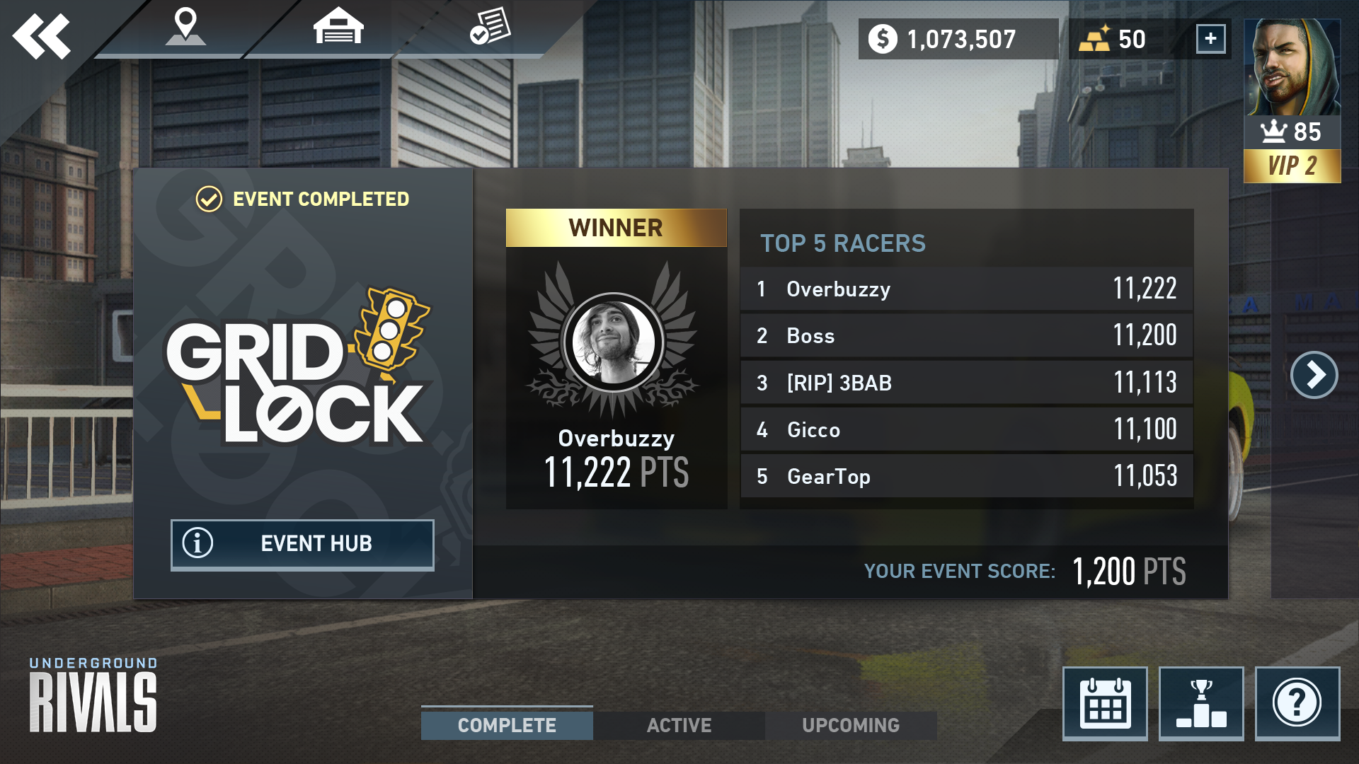
We devised identities for the new feature itself and the weekly events, giving them a distinct theme, visual look and flavor to increase engagement and give players a reason to come back every week.
We decided upon a strong visual link to the events in the UI so players would feel change and progression week to week and be immersed in the event they were browsing or about to race in before they entered the game.
We added a tiered medal system and reward structure to make the progression feel more meaningful and the journey clearer for players.
We added per event leader boards so players could track their progress and be more competitive against others.
We allowed players to easily ‘look ahead’ to upcoming events so they could obtain required cars in advance.
We broke the tutorial into pieces that display contextually so the player receives more information only when it is valuable to them as the new system was more complicated than the old one.
– FINAL MODE AND EVENT BRANDS –
– FINAL LANDING AND DIVISION SCREENS –
SPECIAL EVENTS
Special events are added to the game every title update. I developed unique brands, looks and feels together with the Art and UI Team over 26 unique updates. Below is a selection of brands and events I worked on.
– BRANDING –
– SPECIAL EVENT UI ASSETS EXAMPLE –
PROVING GROUNDS SPECIAL EVENT
Proving Grounds was developed as a recurring Special Event that offers a unique challenge based gameplay experience. I developed the name, brand, treatment and challenge iconography and worked with the Art team to deliver a reusable template so we could quickly generate a new event in the future. I also created extra HUD and an altered postgame sequence required for the new gameplay modes. We successfully have ran 24 of these to date (as of 15th March, 2019).
CARDS AND LOOT
The UI team designed the visual language and the many items and rewards that are used in the game, in conjunction with the Art team. Below are examples of some of the cards, along with the crate interface, which had many requirements to display various information in tandem with each other.
– CARDS AND CRATES –
CONCLUSION
Need for Speed: No Limits was a challenging project to work on, but making the game a success was a rewarding and a great learning experience.
If you’d like to see more, download the game below!


